Today, we present a guest post written by Jeffrey Frankel, Harpel Professor at Harvard’s Kennedy School of Government, and formerly a member of the White House Council of Economic Advisers.
Two Pictures of a “Hoax”
Complete quote: “Obama’s talking about all of this with the global warming and … a lot of it’s a hoax. It’s a hoax. I mean, it’s a money-making industry, OK? It’s a hoax, a lot of it.” — Donald J. Trump, 30 December 2015.
Fed tightening cycles
Last December the Fed began what it thought at the time was a new cycle of tightening. Fed Chair Janet Yellen’s statements last week suggest the Fed still sees this plan as underway. A comparison with historical tightening cycles sheds some light on why so far the Fed hasn’t followed through.
Continue reading
Wisconsin in Last Place for Start-up Activity
The Kauffman Foundation has just released its report on startup activity. Wisconsin comes in last place in startup density.
Interpreting Performance: Japan since 2012
There is widespread belief that Abenomics has led to no increase in output in Japan. It therefore seems useful to examine the data.
“The dollar will go down in value and inflation will start rearing its ugly head,”
So spake Donald J. Trump, September 13, 2012. Here’s what actually happened.
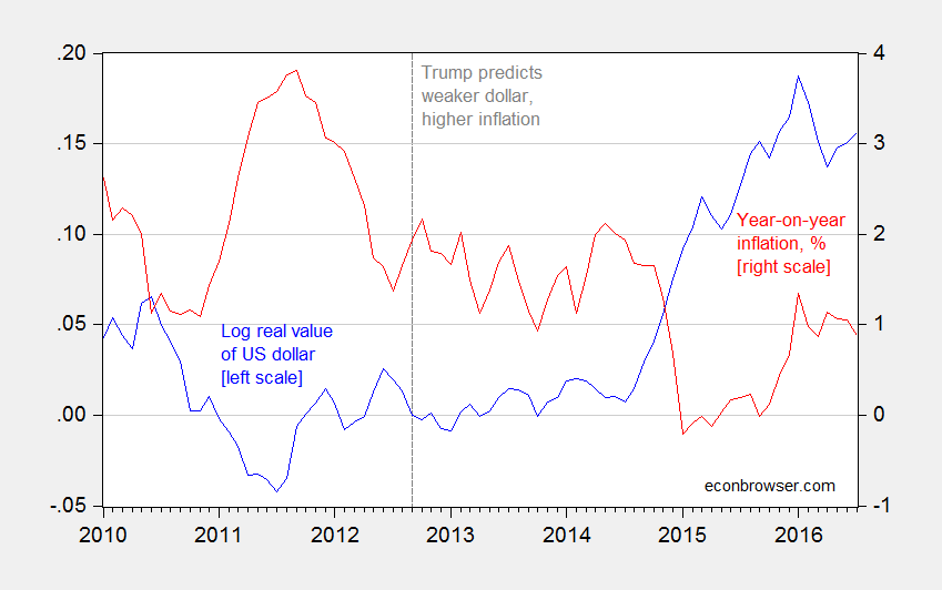
Figure 1: Log real value of US dollar against broad basket of currencies, 2012M09=0 (blue, left scale), and year on year CPI-all inflation, % (red, right scale). Source: Federal Reserve Board, BLS and author’s calculations.
If it’s not obvious, these predictions did not come to pass. Hence, Trump is in the company of Representative Ryan, John Boehner, and Ron Paul, among others.
Guest Contribution: “Trump’s Fiscal Brainstorm: Cut Taxes for the Rich”
Today, we present a guest post written by Jeffrey Frankel, Harpel Professor at Harvard’s Kennedy School of Government, and formerly a member of the White House Council of Economic Advisers. This is an extended version of a column that appeared at Project Syndicate.
Too systemic to fail
Bryan Kelly at the University of Chicago, Hanno Lustig at Stanford and Stijn van Nieuwerburgh at NYU had an interesting paper in the June issue of American Economic Review that used option prices to measure the magnitude of the implicit U.S. government guarantee of the financial sector during 2007-2009.
Continue reading
More on the Kansas-US Unemployment Rate Difference
Bruce Hall says changing dynamics in Kansas have meant that a simple average difference (what I’ve called a individual state fixed effect) in Kansas-US unemployment rates is misleading — or more succinctly put, “the average obfuscates the trend”. So, I allowed a time trend and a square in time trend, in a regression over the 1976-2010 period (data series start in 1976; Brownback takes power in 2011). The t-stats on both coefficients are highly significant. Here is a picture of actual Kansas-US difference and the quadratic trend.
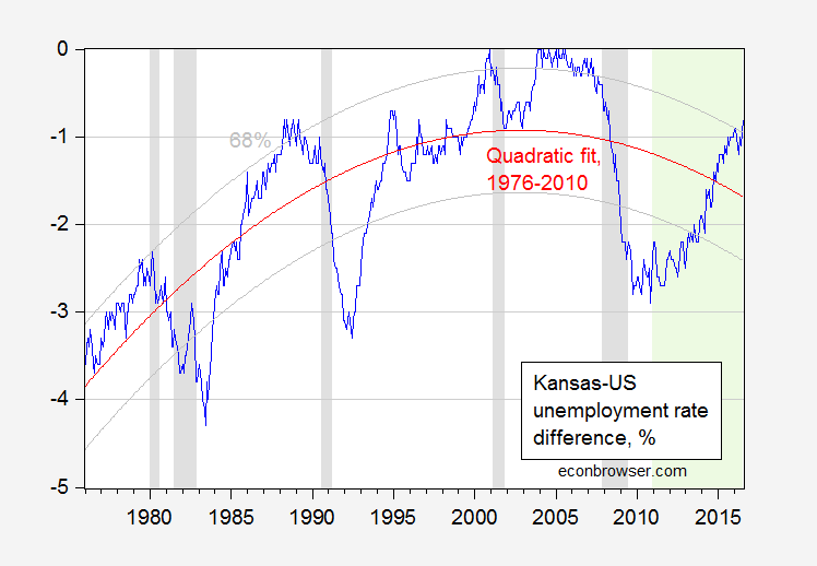
Figure 1: Kansas-US unemployment rate difference, in %, seasonally adjusted (blue), and quadratic fit (red), and 68% prediction interval (gray). NBER defined recession dates shaded gray. Out of sample period shaded green. Source: BLS, NBER, author’s calculations.
Kansas Employment Declines
Bruce Bartlett alerts me to the continuing economic downturn in the state.